Font-size rendering issues between OS X and Windows
I’ve been working more on my Mac recently, and have now twice run into an issue where font-sizes on the Mac and PC are rendering differently, even when defined with a pixel value.
Sample Code
For example, consider the following code:
<!DOCTYPE html PUBLIC "-//W3C//DTD XHTML 1.0 Strict//EN" "http://www.w3.org/TR/xhtml1/DTD/xhtml1-strict.dtd">
<html xmlns="http://www.w3.org/1999/xhtml">
<head>
	<meta http-equiv="Content-Type" content="text/html; charset=UTF-8" />
	<title>Insert title here</title>
</head>
<body>

	<div id="test" style="float:left;background:#e9e9e9;font-size: 16px;font-family:Georgia;">
		This is a simple test. This font should break
		at the same places on all OS'.
	</div>

	<div style="clear:left;">

		<script type="text/javascript">
			var w = document.getElementById("test").offsetWidth;
			document.write('<div style="width:' + w + 'px;background:red;">');
			document.write( "Width of div is: " + w );
			document.write('</div>');
		</script>

	</div>

</body>
</html>
This code creates a floating div element, that will stretch to the width of the contained text. It then creates another element of text using some Javascript to print out the implied with of the first element. I’ll use this to debug differences in font-size rendering between the two OS’.
Rendering Differences
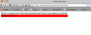
Now, take a look at the result in Firefox on the Mac:
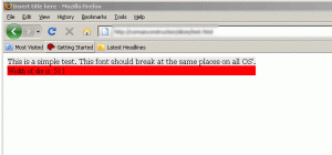
Now, look at the rendering from Firefox on my XP virtual machine:
There’s a 3px width difference! WHY?
An existing article on the web discussing this could be due to the 72 dpi of OS X versus the default 96 dpi of Windows XP.
It’s frustrating as I’ve never run into this developing on Windows and checking on a Mac, only Mac to PC. Odd. More updates as I investigate and attempt to get to the bottom of this…
Update
So it appears as though it’s the anti-aliasing from Photoshop and OS X. They are rendering the fonts at a smaller aggregate width. I found another post about font rendering philosophies. Apparently, Windows does not use a linear method of scaling the fonts? Hrmph.
Looks like I’m used to Windows, and Apple’s default, proper behavior is causing issues for me in the free-for-all, proprietary non-sensical world of Windows.
3 Comments
RSS feed for comments on this post. TrackBack URL


piz says…
Good designs flow well even if the user ups the size of the text. You should NEVER EVER count on a font rendering exactly the same. You never know if a user is forcing a different font or size on your page let alone other issues. Trying to hard code a specific font size is also an accessibility issue.
andy says…
@piz I whole-heartedly agree. It’s a standard for me with website design.
The project I was working on was a design from another contractor that relied heavily on both the horizontal and vertical size of flowed text.
The client wanted as near pixel perfect PSD to HTML conversion as possible – unrealistic from a purist web craftsman point-of-view, but a reality in the real world where 95% of clients are uneducated about accessibility, design, and web standards.
As a front-end developer, I was doing browser testing in Windows when I ran into this issue.
Just another issue to prove designers should thoroughly understand their medium when designing. I wish they’d teach that in design courses at universities!
John S says…
Not sure if this is part of the issue. But I do know that OS X users 72DPI and Windows defaults to 96? I know one thing, I am constantly zooming text on my MacBook. The resolution is high, fonts on some web pages are small and that leads to sore eyes.